在前端项目中,图表的生成算是基本功,使用的场景非常容易出现,所以相应的还是要掌握几种图表制作组件,ECharts是一款基于JavaScript的数据可视化图表库,提供直观,生动,可交互,可个性化定制的数据可视化图表
官网
https://echarts.apache.org/zh/index.html
安装使用
# 安装
npm i echarts
yarn add echarts

# 组件使用时引入
import * as echarts from 'echarts'
使用方式
// 放在DOM加载完成后
onMounted(() => {
  // 解决路由跳转不显示问题
  echarts.dispose(document.getElementById('main1'))
  // 基于准备好的dom,初始化echarts实例
  let myChart = echarts.init(document.getElementById('main1'));

  // 绘制图表
  myChart.setOption({
    title: {
      text: '报告来源'
    },
    tooltip: {},
    xAxis: {
      data: ['国家\n\n机关', '村居\n\n两委', '教育类\n\n从业者', '医疗类\n\n从业者', '旅馆类\n\n从业者', '其他行\n\n业从业者'],
    },
    yAxis: [{
      type: 'value',
      //去掉背景区域
      splitArea: {
        show: false
      },
      // 去除背景线
      splitLine: {
        show: false
      },
      axisLine: { //设置y轴坐标线的样式
        lineStyle: {
          type: 'solid',
          color: '#b8c2c1', //y轴坐标线的颜色
          width: '1' //y轴坐标线的宽度
        }
      },
    }],
    series: [
      {
        name: '销量',
        type: 'bar',
        data: [5, 20, 36, 10, 10, 20]
      }
    ]
  });
})
自定义颜色
series: [
  {
    type: 'pie',
    radius: ['40%', '70%'],
    itemStyle: {
      borderRadius: 2,
      borderWidth: 4,
    },
    labelLine: {
      show: false,
    },
    data: [
      { value: 1048, name: '男生' },
      { value: 735, name: '女生' },
    ],
    // 自定义颜色
    color: ['#1E90FF', '#FF69B4']
  }
]
取消x轴刻度显示
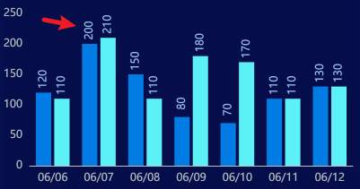
xAxis: {
  type: 'category',
  data: ['06/06', '06/07', '06/08', '06/09', '06/10', '06/11', '06/12'],
  axisTick: {
    show: false, // 取消刻度
  },
  axisLine: {
    lineStyle: {
      type: 'solid',
      color: '#b8c2c1',
      width: '1',
    },
  },
},
label显示
label: {
  show: true,
  position: 'top',
  color: '#9EC4ED',
  fontSize: 12,
  rotate: '90', // 旋转
  offset: [10, 6], // 位置
},
区域面积渐变
series: [
  {
    data: [150, 230, 224, 218, 135, 147, 260],
    type: 'line',
    color: ['#1E90FF'],
    areaStyle: {
      color: {
        type: 'linear',
        x: 0,
        y: 0,
        x2: 0,
        y2: 1,
        colorStops: [
          {
            offset: 0,
            color: 'rgba(58,132,255, 0.5)', // 0% 处的颜色
          },
          {
            offset: 1,
            color: 'rgba(58,132,255, 0)', // 100% 处的颜色
          },
        ],
        global: false, // 缺省为 false
      },
    },
  },
],
图表边距调整
option:{
  grid: {
    left: '36px',
    right: '0%',
    top: '0px',
    bottom: '0px',
  },
}
数据处理(map)
// 数据结构
[
    {
        "data": "2023-10-08",
        "count": 0
    },
    {
        "data": "2023-10-09",
        "count": 0
    },
    {
        "data": "2023-10-10",
        "count": 0
    },
    {
        "data": "2023-10-11",
        "count": 7
    },
    {
        "data": "2023-10-12",
        "count": 4
    }
]

// 数据处理
const echartsX = list.map(function (item) {
  return item.data
})
const echartsY = list.map(function (item) {
  return item.count
})
支持网络请求会刷新
<template>
  <div>
    <div>大门</div>
    <div id="demoShow" style="width: 600px; height: 400px"></div>
  </div>
</template>

<script setup>
import { ref, reactive, onMounted } from 'vue'
import * as echarts from 'echarts'

onMounted(() => {
  // 清除旧实例
  echarts.dispose(document.getElementById('demoShow'))
  demoShow.value = echarts.init(document.getElementById('demoShow'))
  demoShowFunction()
})

// 用于再次更新和销毁实例
let demoShow = ref(null)
function demoShowFunction() {
  demoShow.value.setOption({
    tooltip: {},
    xAxis: {
      data: ['平面设计', '文化墙', '活动项目']
    },
    yAxis: [
      {
        type: 'value',
        splitArea: { show: false },
        splitLine: { show: false }
      }
    ],
    series: [
      {
        name: '数量',
        type: 'bar',
        barWidth: 80,
        label: {
          show: true,
          position: 'top',
          color: '#555',
          fontSize: 16
        },
        data: [
          {
            value: 46,
            itemStyle: {
              color: new echarts.graphic.LinearGradient(0, 0, 0, 1, [
                { offset: 0, color: '#2378f7' },
                { offset: 1, color: '#83bff6' }
              ]),
              shadowColor: '#91cc75',
              borderType: 'dashed',
              opacity: 0.9,
              borderRadius: 6
            }
          },
          {
            value: 44,
            itemStyle: {
              color: new echarts.graphic.LinearGradient(0, 0, 0, 1, [
                { offset: 0, color: '#ff8788' },
                { offset: 1, color: '#ffc9c9' }
              ]),
              shadowColor: '#91cc75',
              borderType: 'dashed',
              opacity: 0.9,
              borderRadius: 6
            }
          },
          {
            value: 43,
            itemStyle: {
              color: new echarts.graphic.LinearGradient(0, 0, 0, 1, [
                { offset: 0, color: '#56b770' },
                { offset: 1, color: '#99d494' }
              ]),
              shadowColor: '#91cc75',
              borderType: 'dashed',
              opacity: 0.9,
              borderRadius: 6
            }
          }
        ]
      }
    ]
  })
}
</script>

<style scoped lang="scss"></style>