Mermaid
Mermaid是一个基于JavaScript的图表生成库,它允许你使用文本语法来定义各种类型的图表,并将其渲染为美观的SVG(可缩放矢量图形)图表。它非常适合在网页、文档或笔记中嵌入流程图、时序图、甘特图等可视化内容。
使用方式
<script src="https://cdn.jsdelivr.net/npm/mermaid/dist/mermaid.min.js"></script>
mermaid.run({ nodes: document.getElementById('content').querySelectorAll('.mermaid') })会将带有.mermaid的div或pre进行渲染
示例
简单使用
<div class="mermaid">
  graph TD;
  A-->B;
  A-->C;
  B-->D;
  C-->D;
</div>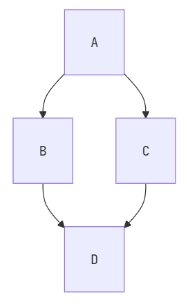
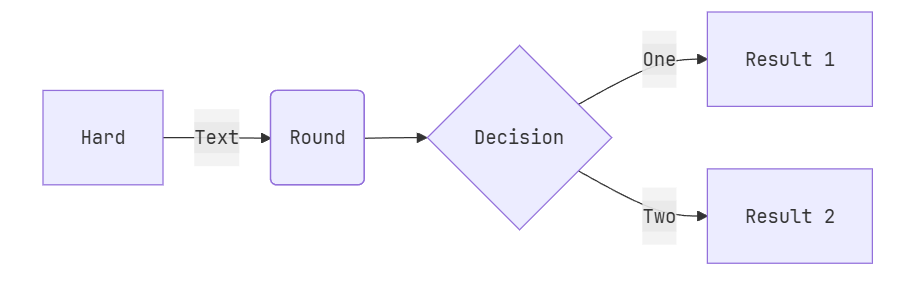
流程图
<div class="mermaid">
flowchart LR
A[Hard] -->|Text| B(Round)
B --> C{Decision}
C -->|One| D[Result 1]
C -->|Two| E[Result 2]
</div>LR表示从左向右,如果需要从上向下,使用TB
也可以配置主题,比如草图形式
<div class="mermaid">
---
config:
  look: handDrawn
  theme: neutral
---
flowchart TB
  A[Start] --> B{Decision}
  B -->|Yes| C[Continue]
  B -->|No| D[Stop]
</div>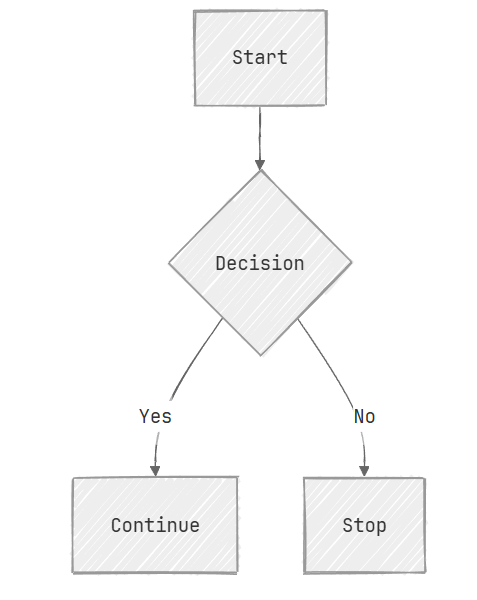
以及节点的形状等都可以配置,更详细可查看中文文档
<div class="mermaid">
flowchart TB
  id1(This is the text in the box) --> id2([This is the text in the box])
  id1 --> id3[[This is the text in the box]]
  id1 --> id4[(Database)]
  id1 --> id5>This is the text in the box]
  id3 --> id6((This is the text in the circle))
  id3 --> id7{This is the text in the box}
  id3 --> id8{{This is the text in the box}}
  id4 --> id9[/This is the text in the box/]
</div>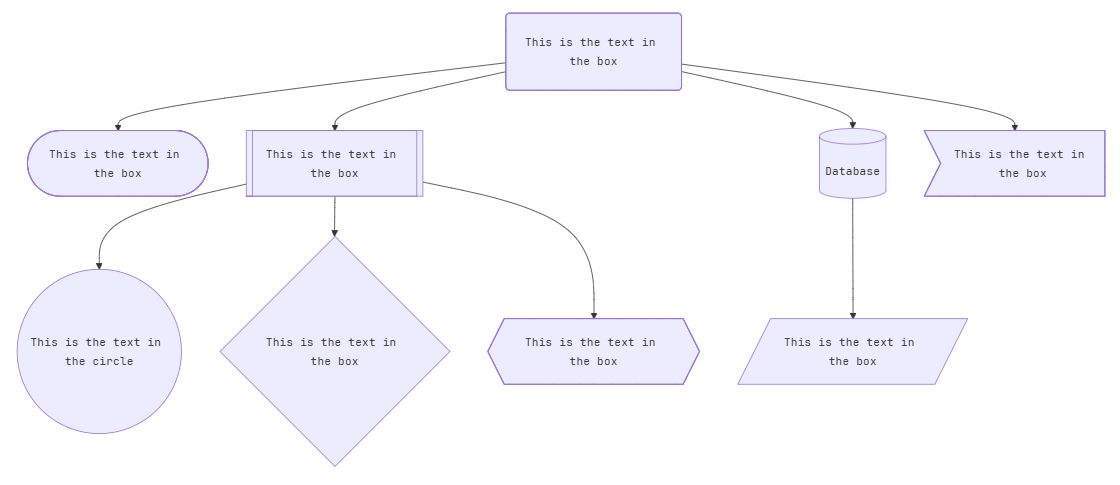
时序图
<div class="mermaid">
sequenceDiagram
Alice->>John: Hello John, how are you?
loop HealthCheck
    John->>John: Fight against hypochondria
end
Note right of John: Rational thoughts!
John-->>Alice: Great!
John->>Bob: How about you?
Bob-->>John: Jolly good!
</div>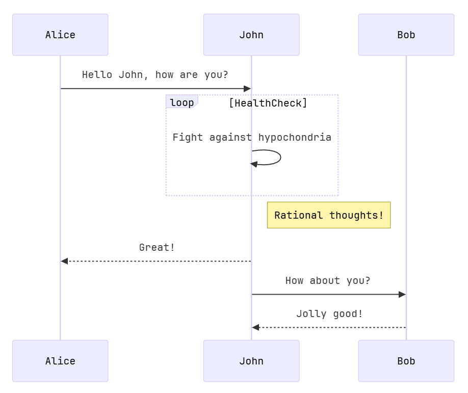
甘特图
<div class="mermaid">
gantt
section Section
Completed :done,    des1, 2014-01-06,2014-01-08
Active        :active,  des2, 2014-01-07, 3d
Parallel 1   :         des3, after des1, 1d
Parallel 2   :         des4, after des1, 1d
Parallel 3   :         des5, after des3, 1d
Parallel 4   :         des6, after des4, 1d
</div>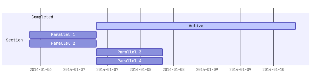
状态图
<div class="mermaid">
stateDiagram-v2
[*] --> Still
Still --> [*]
Still --> Moving
Moving --> Still
Moving --> Crash
Crash --> [*]
</div>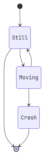
饼图
<div class="mermaid">
pie
"Dogs" : 386
"Cats" : 85
"Rats" : 15
</div>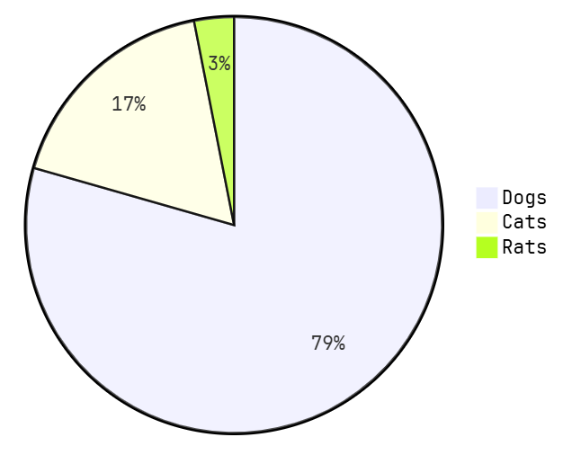
Git图
<div class="mermaid">
gitGraph
   commit
   commit
   branch develop
   commit
   commit
   commit
   checkout main
   commit
   commit
</div>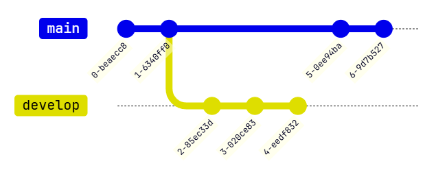
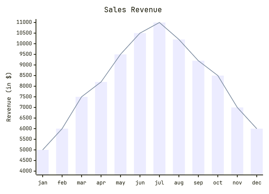
柱状图
<div class="mermaid">
xychart-beta
    title "Sales Revenue"
    x-axis [jan, feb, mar, apr, may, jun, jul, aug, sep, oct, nov, dec]
    y-axis "Revenue (in $)" 4000 --> 11000
    bar [5000, 6000, 7500, 8200, 9500, 10500, 11000, 10200, 9200, 8500, 7000, 6000]
    line [5000, 6000, 7500, 8200, 9500, 10500, 11000, 10200, 9200, 8500, 7000, 6000]
</div>