对于需要类似于文件夹的场景,可以使用ElementPlus的树组件进行更改完成,还能自定义图标、展开和收起等功能,重点是还能实现右击出现功能选项操作
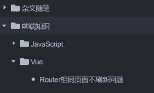
最后样式
Vue代码
<template>
<el-scrollbar height="calc(100vh-var(--header-height))">
    <el-tree
        :data="treeData.list"
        :props="treeData.treeProps"
        show-expand
        node-key="id"
        empty-text=""
        :default-expanded-keys="store.treeExpanded"
        @node-click="treeNodeClick">
        <template #default="{ node, data }">
        <!-- 自定义内容 -->
        <span class="custom-tree-node">
            <svg v-if="data.type === 1" xmlns="http://www.w3.org/2000/svg" xmlns:xlink="http://www.w3.org/1999/xlink" viewBox="0 0 512 512"><path d="M464 128H272l-64-64H48C21.49 64 0 85.49 0 112v288c0 26.51 21.49 48 48 48h416c26.51 0 48-21.49 48-48V176c0-26.51-21.49-48-48-48z" fill="currentColor"></path></svg>
            <svg v-if="data.type === 2" t="1682258596610" class="icon" viewBox="0 0 1024 1024" version="1.1" xmlns="http://www.w3.org/2000/svg" p-id="45893" width="200" height="200"><path d="M512 320a192.064 192.064 0 0 1 0 384 192 192 0 0 1 0-384z" fill="currentColor" p-id="45894"></path></svg>
            <span>{{ node.label }}</span>
        </span>
        </template>
    </el-tree>
</template>

<script setup>
// 树结构
let treeData = reactive({
  treeProps: {
    label: "name",
    children: "child",
  },
  list: [],
});

// 树点击
function treeNodeClick(data, a) {
  // 每一个数据
  console.log(data)
  // a.expanded可以判断是否展开
  console.log(a)
}
</script>

<style scoped lang="sass">
// 调整图标样式
.custom-tree-node
    svg
    width: 18px
    height: 18px
    position: relative
    top: 3px
    margin-right: 4px
</style>
Tree组件样式调整
\:root
  // 树组件hover颜色
  --el-tree-content-hover: #f5f7fa

.dark
  // 树组件hover颜色
  --el-tree-content-hover: #2c313a

//  树样式
.el-tree
  // 树背景颜色(包含没有数据的情况下,防止刷新时没有数据呈现不同背景颜色)
  background-color: var(--background-color) !important
  // 树内容,即每一项
  .el-tree-node__content
    // 给每一项固定背景颜色,防止点击后出现不一样的背景色
    background-color: var(--background-color) !important
    // 调整每一项的高度
    height: 36px !important
    // 调整每一项的颜色,兼容暗黑模式
    color: var(--text-color-default)
    // 自定义每一项的hover背景色
    &:hover
      background-color: var(--el-tree-content-hover) !important
    &:focus
      background: none !important
方法的使用
<el-tree ref="dataTreeRef">
let dataTreeRef = ref()
dataTreeRef.value.append(data, item)