CSS样式调整
在文件source/css/main.styl中的末尾增加自己喜欢的样式,如:
body {
  // 字体调整
  font-family: Helvetica, 'PingFang SC', 'Hiragino Sans GB', 'Microsoft YaHei', '微软雅黑', Arial, sans-serif;
  // 防止页面因没有滚动条导致的右移现象
  min-height: 100.1vh;
}
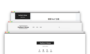
网站名导航背景
在样式文件next/source/css/main.styl中直接配置,注意图片路径能访问到就行
// 侧边网站名背景
.site-brand-container {
  background-image: url(/images/side_bg.png);
  background-position: center center;
  background-repeat: no-repeat;
  background-size: cover;
}
固定页面宽度
注意:测试主题为Pisces
使用过5.x版本的Next就会发现,那时的页面宽度是固定的,并且比较窄,而升级到8.x后,发现页面宽度较宽,而且屏幕越大越宽,解决办法:编辑source/css/_variables/Pisces.styl:
$content-desktop-large        = 1200px;
$content-desktop-largest      = 1200px;
关闭代码行数
// 关闭代码行数
.gutter{
  display: none;
}
美化滚动条
/* 定义滚动条 */
::-webkit-scrollbar {
    width: 7px;
    height: 7px;
    border-radius: 10px;
}
/* 定义滚动条滑块 */
::-webkit-scrollbar-thumb {
    background-color: #0003;
    border-radius: 10px;
}
/* 滑块hover效果 */
::-webkit-scrollbar-thumb:hover {
    background: #B2B2B2;
}
字体大小调整
// 文章整体字体大小
.post-body {
  font-size: 16px;
}
// 文章目录文字大小
.sidebar-panel-container{
  font-size: 15px;
}
取消顶部横条
.headband {
  display: none;
}
图片增加边框
.post-body img {
  border: 1px solid rgba(0,0,0,0.1);
}
隐藏侧边作者名字
.site-author-name {
  display: none;
}
作者描述样式调整
字数少不建议
.site-description {
  text-align: left;
  text-indent: 2em;
  margin-top: 10px;
  font-size: 0.85em;
  padding: 0 14px;
}
底部信息不换行及文章信息调整
// 底部调整为一列展示
.footer-inner {
  display: block;
}
.footer-inner div {
  display: inline-block
}
// 不蒜子统计底部位置调整
.busuanzi-count {
  margin: 0 3px;
}
#busuanzi_container_site_pv {
  margin-left: 2px;
}
// 去除文章信息和底部分割线
:not(.post-meta-break) + .post-meta-item::before {
  display: none;
}
// 调整头部信息间距
.post-meta > span {
  margin: 0 7px;
}
多级分类展示分割调整
文章多级分类时,在头部信息中会出现逗号分隔,不是很美观,只需要调整文件next/languages/zh-CN.yml中的comma: ","为comma: "/"即可
文字选中颜色
::-moz-selection {
  // firefox
  background: #638bff;
  color: #ffffff;
}
::selection {
  // 其他浏览器
  background: #638bff;
  color: #ffffff;
}
取消代码块部分加粗
.hljs-attribute, .hljs-doctag, .hljs-keyword, .hljs-meta .hljs-keyword, .hljs-name, .hljs-selector-tag, .hljs-section, .hljs-title {
  font-weight: 500;
}
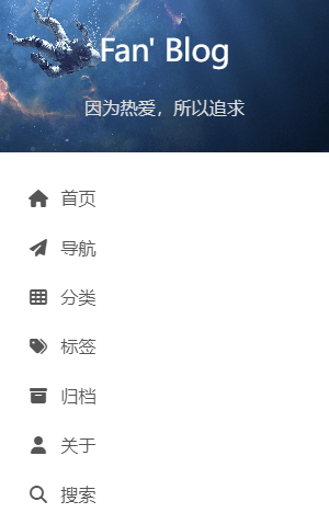
导航和返回顶部背景颜色
// 导航背景颜色调整,防止与body背景颜色一致
.menu-item a:hover, .menu-item a.menu-item-active{
  background: #d7e3f7;
}
// 返回顶部按钮背景颜色调整,防止与body背景颜色一致
.back-to-top{
  background-color: #d7e3f7;
}
关闭文章侧边目录序号
先在配置文件中进行关闭
toc:
  enable: true
  # Automatically add list number to toc.
  number: false # 关闭文章目录序号
  # If true, all words will placed on next lines if header width longer then sidebar width.
  wrap: false
  # If true, all level of TOC in a post will be displayed, rather than the activated part of it.
  expand_all: false
  # Maximum heading depth of generated toc.
  max_depth: 6
然后在样式文件中对样式做调整
// 调整文章目录导航(取消数字后)
.post-toc ol {
  padding: 0 12px;
}
分类中多余图片
分类的作用本就是快速查找到文章,结果发现文章中photo的图片出现在了分类中,实属占地😂,去除方法,打开layout/_macro/post-collapse.njk,注释或删除以下代码:
{{ post_gallery(post.photos) }}
分类中月份处理
调整分类中的时间显示格式,在layout/_macro/post-collapse.njk将格式化更改为YYYY-MM-DD:
<div class="post-meta-container">
  <time itemprop="dateCreated"
        datetime="{{ moment(post.date).format() }}"
        content="{{ date(post.date, config.date_format) }}">
    {{ date(post.date, 'YYYY-MM-DD') }}
  </time>
</div>
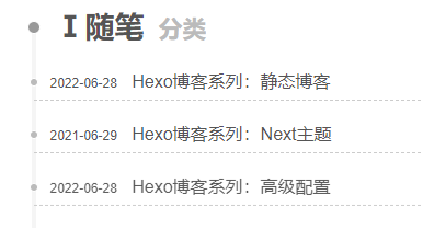
当文章的年份不一样时,会出现以下情况,不是很美观
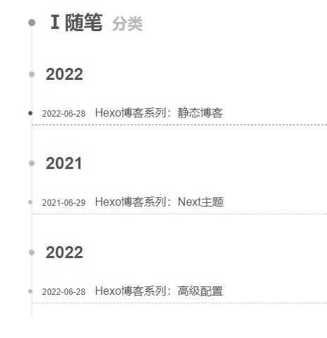
所以建议将年取消,在layout/_macro/post-collapse.njk将以下代码删除
{%- if year !== current_year %}
  {%- set current_year = year %}
  <div class="collection-year">
    <span class="collection-header">{{ current_year }}</span>
  </div>
{%- endif %}
同时对样式进行调整:
// 调整分类中文章间隔
.posts-collapse .post-content .post-header {
  margin: 15px 0px;
}

// 修复分类中文章做出小点位置
.posts-collapse .post-content .post-header::before {
  left: -4px;
}
最后样子
同时也可以在网站配置文件中对分类下文章分页数量进行设置
# Pagination
## Set per_page to 0 to disable pagination
per_page: 100
pagination_dir: page
其他样式相关调整
// 分页样式
.pagination .page-number.current {
  background: #222222;
  border-color: #222222;
  color: #fff;
}
// 减少文章与顶部的距离(首页和文章页)
.post-block:first-of-type {
  padding-top: 0;
}
// 调整文章标题上下的间距
.posts-expand .post-title {
  margin: 20px 0 15px 0;
}
// 文章标题与图片距离
.posts-expand .post-gallery {
  margin-bottom: 10px;
}
// 首页文章标题与简介距离
.posts-expand .post-header {
  margin-bottom: 10px;
}
// 首页文章简介与阅读更多按钮距离
.post-button {
  margin-top: 20px;
}
// 文章信息与文章内容的间距
.post-meta {
  margin-bottom: 20px;
}
// 文章段落间距调整
.post-block p {
  margin-bottom: 15px;
  line-height: 1.7;
}
// 调整表格
th, td {
  border-bottom: none;
}
// 引用样式
blockquote {
  border-left: 4px solid #222222;
  background-color: #eee;
  margin-bottom: 20px;
}
// 引用距离调整
blockquote p {
  margin: 0;
  padding: 10px 0;
}
// 行内代码块
code {
  color: #ff7600;
  background: #EFF2F3;
  margin: 2px;
}
// 超链接样式
.post-body p a {
  color: #65a1d6;
  transition: all .1s;
}
.post-body p a:hover {
  color: #ff7600;
}
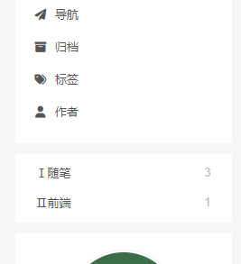
自定义分类到侧边
如果习惯使用一级分类,在使用时会发现点击分类会多点击一次,其实可以将分类放到侧边更加便捷
编辑layout/_layout.njk,在<header>中加入以下代码:
<header class="header" itemscope itemtype="http://schema.org/WPHeader">
  <div class="header-inner">
    {%- include '_partials/header/index.njk' -%}
  </div>

  {# 自定义分类 #}
  <div class="header-inner myCate">{% include '_partials/page/categoriesCustom.njk' %}</div>

  {%- if theme.sidebar.display !== 'remove' %}
    {% block sidebar %}{% endblock %}
  {%- endif %}
</header>
然后创建layout/_partials/page/categoriesCustom.njk文件,内容为:
<div class="category-all-page">
  <div class="category-all">
    {{ list_categories() }}
  </div>
</div>
然后就可以把导航中的分类隐藏了,并对样式做相应的调整:
// 自定义分类样式调整
.myCate {
  margin-top: 12px;
  box-sizing: border-box;
  padding: 5px 0;
  border-radius: 1px;
}
.cate-title {
  height: 20px;
  width: 100%;
  font-size: 0.8125em;
  padding: 0 20px 10px 20px;
  font-weight: bold;
}
.myCate li {
  padding: 0 23px;
  line-height: 32px;
}
.myCate .category-list-item {
  margin: 0;
  transition: all .2s;
}
.myCate .category-list-item:hover {
  background-color: #F5F5F5;
}
.myCate .category-all {
  margin-top: 0;
}
// 自定义分类统计靠右
.myCate .category-list-count {
  float: right;
}
// 自定义分类下划线
.myCate .category-list-link {
  border-bottom: none;
  font-size: 0.8125em;
}
.myCate .category-list-count {
  font-size: 0.8125em;
}
// 去除文章数量的括号
.myCate .category-list-count::before {
  content: '';
}
.myCate .category-list-count::after {
  content: '';
}
// 取消代码行数字,兼容横向滑动
.table-container .gutter {
  display: none !important;
}
滚动条配置
使用jQuery.NiceScroll解决,将jquery.nicescroll.min.js文件复制到next/source/js/
在文件themes\next\layout\_scripts\index.njk末尾加上
{{- next_js('jquery.nicescroll.min.js') }}
然后在文件themes\next\layout\_layout.njk的body结束前加上
<script>
  $(document).ready(function () {
      $(".use-motion").niceScroll();
  });
</script>
注意:在使用后发现,水平滚动条没有效果,即代码的滚动条并没有起到作用,看起来不协调。同时,改滚动插件存在bug,滚动时控制台会报错,网页会出现下半部分内容无法上滑的问题,谨慎使用
站点收录
在百度搜索资源平台进行配置,同时安装sitemap生成工具,就能访问到站点地图
npm install hexo-generator-sitemap
站点地图地址为/sitemap.xml
